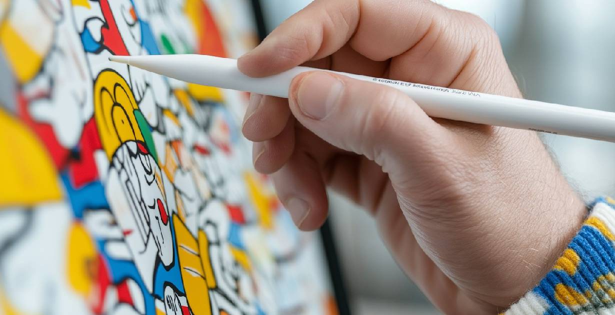
Master Composition: Create Balanced and Impactful Graphics

Great design starts with a question: What makes certain graphics stand out while others fade into the background? The answer lies in composition (the art of arranging visual elements to create balance, focus, and meaning). Whether you’re a graphic designer or you own a business, understanding composition can completely transform how you approach graphics and boost your visual communication.
What Is Composition in Graphic Design?
At its core, composition is the arrangement of elements (images, text, shapes, and colors) on a canvas. It is about creating harmony and guiding the viewer’s eye. Think of it as the foundation of graphics, very much like a blueprint for an architect. Without strong composition, even the most beautiful elements can look disjointed or confusing.
A classic example? Movie posters. Notice how your eyes are drawn first to the central character and then to the supporting details? That’s composition at work!
Why Does Composition Matter in Graphics?
Strong composition is not only just about the aesthetics of it; it’s about communication. Well-composed graphics achieve three critical goals:
- Grab Attention: Your audience should notice your design at first glance.
- Communicate Clearly: The message should be easy & simple to understand.
- Evoke Emotion: Great design connects with the audience on a deeper level.
For example, when a brand redesigns its logo with poor composition, the audience might feel disconnected, even if they don’t realize why. Strong composition ensures every visual element works together to leave a lasting impression.

The How: Key Principles for Mastering Composition Like a Pro
- Balance is Everything
Balance refers to distributing visual weight evenly across your design. Symmetrical balance feels orderly, while asymmetrical balance can create dynamic tension. Consider a website layout where the image on one side is balanced by text on the other—a simple yet effective approach.
- Use the Rule of Thirds
Divide your canvas into a 3×3 grid and position key elements along the grid lines or intersections. This technique creates natural focal points and adds structure to your graphics.
- Hierarchy Guides the Eye
Use size, color, and placement to emphasize the most important elements. Headlines, for instance, should be larger and bolder than supporting text. - Don’t Overcrowd the Canvas
White space is your friend. It gives your design breathing room and prevents visual overload. Minimalism in graphics often conveys sophistication. - Leverage Contrast
The Contrast between colors, shapes, or sizes ensures elements stand out. Bright text on a dark background is a classic example.
How to Start Improving Your Graphics Today
Ask yourself these three questions the next time you design:
- Is my message clear at first glance?
- Do my elements guide the viewer’s eye effectively?
- Have I created balance and used space wisely?
If you’re unsure about the answers, it’s time to revisit your approach to composition.
Need Help with Graphics? Let Media Vaccine Transform Your Visuals
Strong composition is the difference between graphics that are noticed and graphics that are remembered. At Media Vaccine, we specialize in creating visually stunning and strategically composed designs that leave an impact.
Contact us today to bring your vision to life with expertly crafted graphics. Let’s make your brand unforgettable.
Email: mediavaccine@aol.com
Phone: +1 (204) 647-5998
see more related topics here.


